Nifty
v2.5
Have a question ?
If you have any questions or issues that are beyond the scope of this documentation, please feel free to email us.
* Support is offered exclusively through the contact form
Change Logs
New |
Profile picture in navigation bar |
New |
Boxed layout with background image |
New |
Floating Aside |
New |
Fixed Fluid Grid System |
New |
Toggle Switch Plugin |
New |
Magic Check Plugin |
New |
Select2 Plugin |
New |
Bootstrap Markdown |
New |
Email Templates |
Updated |
jQuery to version 2.2.4 |
Updated |
Font Awesome to version 4.6.3 |
Updated |
Metismenu to version 2.5.2 |
Updated |
Pace to version 0.7.6 |
Updated |
Animate.css to version 3.5.2 |
Improved |
Web performance |
Improved |
Add more helper classes |
Improved |
GUI appearance to all elements |
Improved |
Increase Contrast of color schemes |
Fixed |
Incorrect brand size on the SASS/SCSS files |
Fixed |
IE keep showing nav badge although on the collapsed mode |
Fixed |
Issues when the animations are disabled. |
Fixed |
Prevent page scrolling when the navigation bar is fixed to the top |
Improved |
User Interface Design |
Fixed |
Issue with Datepicker initialization |
Fixed |
Minor CSS issues |
New |
Boxed Layout |
New |
IonIcon Plugin |
New |
Themify Plugin |
New |
2000+ Premium Icon Sets |
Updated |
jQuery to version 2.2.1 |
Updated |
Bootstrap to version 3.3.6 |
Updated |
Animate.css to version 3.5.1 |
Updated |
FontAwesome to version 4.6.1 |
Updated |
Datepicker Plugin |
Updated |
Bootstrap Select Plugin |
Updated |
Bootstrap Table Plugin |
Updated |
TagInput Plugin |
Updated |
Chosen Plugin |
Updated |
DropzoneJS Plugin |
Updated |
Summernote Plugin |
Updated |
Fastclick Plugin |
Updated |
Metismenu Plugin |
Updated |
NanoScroller Plugin |
Updated |
Pace Plugin |
Updated |
Switchery Plugin |
Improved |
UI and CSS transitions |
Improved |
Documentation |
New |
Support SASS and SCSS |
New |
Fully Layered and Editable Dashboard (PSD) file |
Updated |
FontAwesome to the latest version |
Improved |
User Interface Design |
Fixed |
Minor CSS issues |
Improved |
UI and CSS transitions |
Improved |
Documentation |
Improved |
Noftification plugin |
Fixed |
Navigation toggle button issue on mobile device |
Fixed |
Minor CSS issues |
Improved |
Documentation |
Improved |
Navigation with Ajax Support |
Improved |
Checkboxes and radio button components |
Fixed |
Initialization issues on some framework. |
Improved |
Remove Fade-in effect when a page has loaded |
Fixed |
Aside issue on small screen |
Fixed |
Minor CSS issues |
Updated |
Bootstrap to version 3.3.2 |
Updated |
FontAwesome to version 4.3.0 |
New |
Two column timeline |
New |
Static tables page |
New |
Bootstrap tables page |
New |
DataTables plugin |
New |
FooTable plugin |
New |
FullCalendar plugin |
New |
Maps plugin |
New |
9 new color schemes |
Improved |
UI and CSS transitions |
Improved |
Checkboxes and radio plugin |
Improved |
Megamenu plugin for touch devices |
Improved |
Fresh flat color schemes |
Fixed |
Issue with scrolling items on touch devices |
Fixed |
Minor CSS issue |
New |
Getting Started sample |
Improved |
Header GUI design |
Improved |
Plugin compatibility |
Improved |
Change folder structure and HTML code slightly |
Updated |
MetisMenu plugin |
Updated |
Switchery plugin |
Updated |
EasyPieChart plugin |
Updated |
Chosen plugin |
Updated |
Pace plugin |
Updated |
Datepicker plugin |
Updated |
MaskInput plugin |
Updated |
Bootstrap DataTable plugin |
Fixed |
Off-canvas navigation and aside issue |
Improved |
Add more widgets to Dashboard |
Improved |
Clean and fresh flat color schemes |
Fixed |
Collapsed navigation doesn't show menu sub-items on the iPad |
Fixed |
Minor CSS issue |
Updated |
Bootstrap to version 3.3.1 |
New |
To-do List |
New |
New statistics widgets |
New |
User profile widgets |
New |
New weather Widgets |
New |
Pricing table |
New |
Megamenu Plugin |
New |
Layouts page |
New |
List group page |
New |
Progressbar Page |
New |
jQuery cookie |
| - User can make best theme by mix the style and color | |
| - Remember user's favourite theme and apply it to all pages | |
Fixed |
Speed improvements |
Fixed |
Progressbar with label |
Fixed |
Tab direction |
Fixed |
Minor bugs in design |
Release |
Initial release |
Introduction
Nifty is is flat admin template for multi-purpose usage built with the latest version of Bootstrap v3.3.6.
Its main focus is simplicity while providing the most commonly used elements and widgets on web apps across devices and browsers, and it will be extended in the future updates with newer plugins and pages.
Getting Started
To get you started with Nifty theme, you should be familiar with Twitter Bootstrap. Start with this basic HTML template, or modify these examples.
Use Chrome Developer Tools (Chrome), Firebug (Firefox) or similar plugins to analyze the code. To get a deeper understanding of the code, open the HTML and JS files and read through the commented code.
Quick Tips
-
Mobile First
The default CSS styles work great in mobiles. The responsive CSS code alter the styles in larger resolutions. -
ID and Class name
You may remove all ID or Class names which containdemo-, they are only used for demonstration. -
Plugins
Feel free to remove the plugins you won't use (along with their style). -
User Names
All user names used in the template are fictional and only used for demostration. They were randomly generated at uinames.com.
File and Folder Structure
| Folder Name | What it Contains |
|---|---|
| Documentation | This documentation page with it's assets. |
| Get Started | Samples that will help you start developing. |
| Demo | Most of the main CSS, JavaScript and images. |
| css | Main CSS stylesheets. |
| demo | Stylesheet for demonstration purposes. |
| fonts | Font Awesome |
| img | Main images for demonstration purposes. |
| js | Main JavaScript files. |
| demo | Sample script for demonstration purposes. |
| LESS / SASS / SCSS | Pre-processing sources files for generating the CSS-files. |
| nifty | Complete layout and element-styling |
| themes | Folder that contains all the available color schemes. |
| plugins | JavaScript and partial images for all 3rd-party plugins. |
| premium | Contains our premium content free for use in your project. Please read carefully the license agreement! |
LESS, SASS and SCSS Files
Files and Structure
less/nifty
Folder that contains all main styles of the template.
less/themes
Folder that contains all the available color themes. Each file contains predefined variables with the colors of each theme. A file can be imported in /less/nifty.less to change the active color theme by overwriting the default variables which are set in less/_variables.less.
less / _variables.less
This is the variables file. From here you can set various variables to easily change the colors or other template options.
less / nifty.less
This is the only Less file that needs to be included in the template since it imports all required files. Here you can import a separate color theme file from less/themes/ folder, to overwrite the default color variables and change the active color theme.
less / themes / {type} / {theme-name}.less
This is the themes file. It contains classes that can be used to alter the color, the background color or the border color of an element individually. It contains main colors of all the available themes.
Recompile LESS
First of all you should be aware of the structure from the LESS-file.
So you will see that whenever you change a file in less you must only recompile less/nifty.less because it imports all other files. Same with less/_variables.less. Save the compiled less as css/nifty.css.
INFO :
If you make changes directly in the CSS and/ or LESS-files from Nifty, it will be hard to update if we release an update.
So we would recommend to create a new CSS/ LESS-file for this purpose.
Color Themes
You must only recompile less/themes/type-*/*.less.
To create your own, simply copy-paste one of the existing, give it a new name and alter the colors to match your preference.
Template
All template files have a fixed structure consisting of navbar, mainnav and content,
while for aside and footer is just extra if you need it.
Animation
There are several animations in Nifty admin template. Simply add class name effect in the #container, if necessary combined with transition function names.
To disable the animations in the navigation and sidebar, simply by removing the class .effect and the transition function names on the #container.
| Transition function name | Class name |
|---|---|
| ease | .effect |
| easeInQuart | .easeInQuart |
| easeOutQuart | .easeOutQuart |
| easeInBack | .easeInBack |
| easeOutBack | .easeOutBack |
| easeInOutBack | .easeInOutBack |
| steps | .steps |
| jumping | .jumping |
| rubber | .rubber |
INFO
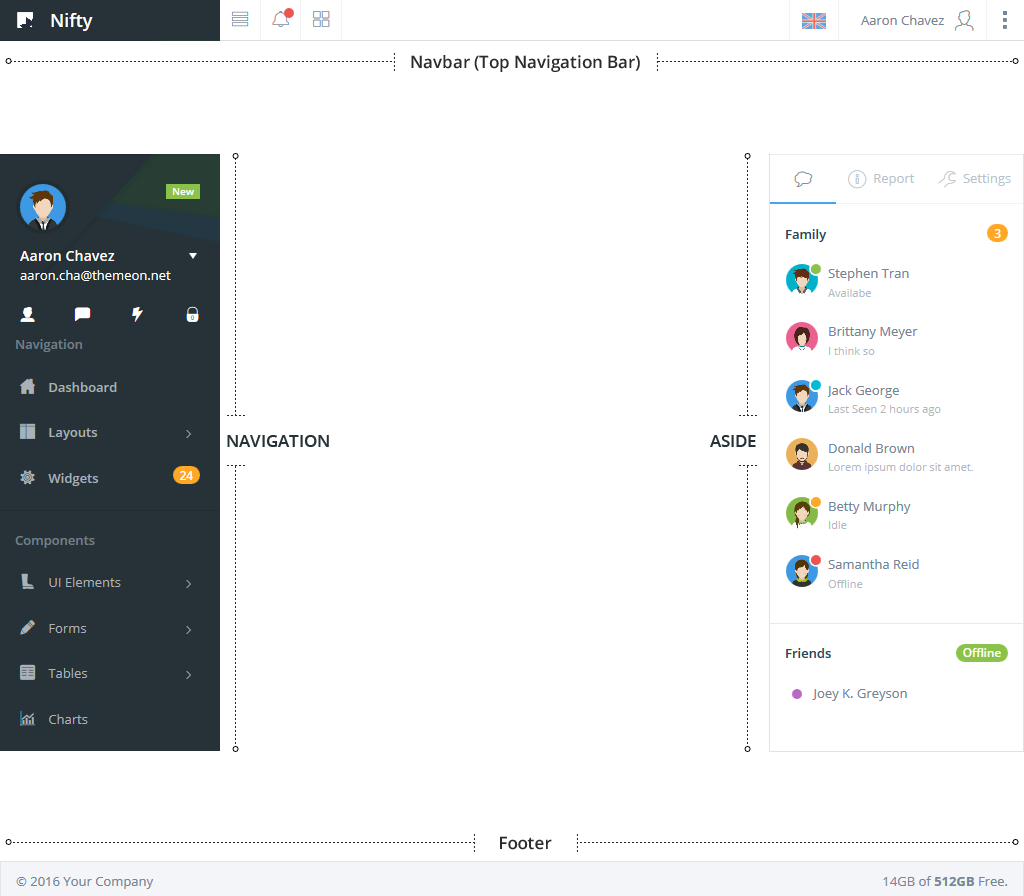
Navbar (Top Navigation Bar)
There are two options for the navbar : static and fixed to the top page. The default is static position.
Please add class .navbar-fixed to the #container to make it fixed to the top of page.
HTML
<body>
    <div id="container" class="navbar-fixed">
    ...
    ...
    </div>
</body>
Navigation
General Methods
| JavaScript | Description |
|---|---|
$.niftyNav('bind'); |
Bind or re-bind the navigation |
$.niftyNav('refresh'); |
Refresh the navigation |
Collapsing/Expanding Navigation
For small devices screen sizes, the navigation will only be visible if activated by the top right menu icon. This is especially handy for distraction-free mobile reading.
To start page with expanded navigation by default, just add class .mainnav-lg to #container, or .mainnav-sm to collapsed the navigation by default.
HTML
<body>
    <div id="container" class="mainnav-lg">
    ...
    ...
    </div>
</body>
Via JavaScript
Call the navigation plugin via JavaScript
$.niftyNav('collapse');

$.niftyNav('expand');
Toggle Method
Toggle the navigation via JavaScript. It will toggle between two states: collapsed and expanded.
$.niftyNav('colExpToggle');
Off Canvas Navigation
The navigation that responsively goes off canvas, similar to an app style menu also can be revealed in many creative ways. There are three mode of off-canvas navigation.
1. Push
The navigation will push page content to the right. Add class .mainnav-in to the #container to show the navigation or .mainnav-out to hide the navigation by default.
HTML
<body>
    <div id="container" class="mainnav-in push">
    ...
    ...
    </div>
</body>
Toggle Button
You can create a toggle button in your application by adding .mainnav-toggle.push as an class to the button without using any JavaScript.
<a href="#" class="btn mainnav-toggle push">Toggle Navigation</a>

<!-- OR -->

<button class="btn mainnav-toggle push">Toggle Navigation</button>
Via JavaScript
Switch between navigation mode via JavaScript
$.niftyNav('pushIn');

$.niftyNav('pushOut');
Toggle Method
Toggle the navigation via JavaScript. It will toggle between two states: push-in and push-out.
$.niftyNav('pushToggle');
2. Slide in on top
Add class .mainnav-in to the #container to show the navigation or .mainnav-out to hide the navigation by default.
HTML
<body>
    <div id="container" class="slide mainnav-in">
    ...
    ...
    </div>
</body>
Toggle Button
You can create a toggle button in your application by adding .mainnav-toggle.slide as an class to the button without using any JavaScript.
<a href="#" class="btn mainnav-toggle slide">Toggle Slide</a>

<!-- OR -->

<button class="btn mainnav-toggle slide">Toggle Slide</button>
Via JavaScript
Switch between navigation mode via JavaScript
$.niftyNav('slideIn');

$.niftyNav('slideOut');
Toggle Method
Toggle the navigation via JavaScript. It will toggle between two states: slide-in and slide-out.
$.niftyNav('slideToggle');
3. Reveal
Add class .mainnav-in to the #container to show the navigation or .mainnav-out to hide the navigation by default.
HTML
<body>
    <div id="container" class="reveal mainnav-in">
    ...
    ...
    </div>
</body>
Toggle Button
You can create a toggle button in your application by adding .mainnav-toggle.reveal as an class to the button without using any JavaScript.
<a href="#" class="btn mainnav-toggle reveal">Toggle Reveal</a>

<!-- OR -->

<button class="btn mainnav-toggle reveal">Toggle Reveal</button>
Via JavaScript
Switch between navigation mode via JavaScript
$.niftyNav('revealIn');

$.niftyNav('revealOut');
Toggle Method
Toggle the navigation via JavaScript. It will toggle between two states: reveal-in and reveal-out.
$.niftyNav('revealToggle');
Fixed Position
There are two options for the navigation position : static and fixed to the top page. The default is static position.
Static As you scroll down the site, so does the navigation.
Fixed As you scroll down the site, the navigation stays fixed in place,
so that it's always displaying, no matter where you are on the page.
Add class .mainnav-fixed to the #container it fixed to the top of page.
HTML
<body>
    <div id="container" class="mainnav-fixed">
    ...
    ...
    </div>
</body>
Via JavaScript
Switch the navigation position state via JavaScript
$.niftyNav('staticPosition');

$.niftyNav('fixedPosition');
Toggle Method
Toggle the navigation position via JavaScript. It will toggle between two states: fixed and static.
$.niftyNav('togglePosition');
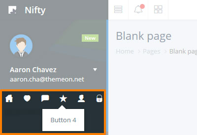
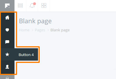
Shortcuts
Shortcut buttons
Add more shortcut buttons to the navigation, it supports up to six buttons.
HTML
<div id="mainnav-shortcut">
    <ul class="list-unstyled">

        <!-- Shortcut buttton-->
        <!-- ~~~~~~~~~~~~~~~~~~~~~~~~~~~~~~~~ -->
        <li class="col-xs-2" data-content="Button 1">
            <a class="shortcut-grid" href="#" >
                <i class="fa fa-music"></i>
            </a>
        </li>

        <!-- Shortcut buttton-->
        <!-- ~~~~~~~~~~~~~~~~~~~~~~~~~~~~~~~~ -->
        <li class="col-xs-2" data-content="Button 2">
            <a href="#" class="shortcut-grid">
                <i class="fa fa-star"></i>
            </a>
        </li>

        <!-- Shortcut buttton-->
        <!-- ~~~~~~~~~~~~~~~~~~~~~~~~~~~~~~~~ -->
        <li class="col-xs-2" data-content="Button 3">
            <a href="#" class="shortcut-grid">
                <i class="fa fa-video-camera"></i>
            </a>
        </li>

        <!-- Shortcut buttton-->
        <!-- ~~~~~~~~~~~~~~~~~~~~~~~~~~~~~~~~ -->
        <li class="col-xs-2" data-content="Button 4">
            <a href="#" class="shortcut-grid">
                <i class="fa fa-heart"></i>
            </a>
        </li>

        <!-- Shortcut buttton-->
        <!-- ~~~~~~~~~~~~~~~~~~~~~~~~~~~~~~~~ -->
        <li class="col-xs-2" data-content="Button 5">
            <a href="#" class="shortcut-grid">
                <i class="fa fa-user"></i>
            </a>
        </li>

        <!-- Shortcut buttton-->
        <!-- ~~~~~~~~~~~~~~~~~~~~~~~~~~~~~~~~ -->
        <li class="col-xs-2" data-content="Button 6">
            <a href="#" class="shortcut-grid">
                <i class="fa fa-lock"></i>
            </a>
        </li>
    </ul>
</div>
Widgets
You can put a small widget to the navigation.
HTML
<div class="mainnav-widget">
    <div class="show-small">
        <!-- Show the button/icon on the collapsed navigation -->
    </div>

    <div class="hide-small mainnav-widget-content">
        <!-- Widget content here -->
    </div>
</div>
Aside
General Methods
| JavaScript | Description |
|---|---|
$.niftyAside('bind'); |
Bind or re-bind the aside |
$.niftyAside('refresh'); |
Refresh the aside |
Visibility
The visibility function let you show or hide the aside.
HTML
<body>
    <div id="container" class="aside-in">
    ...
    ...
    </div>
</body>
Toggle Button
You can create a toggle button in your application by adding .aside-toggle as an class to the button without using any JavaScript.
<a href="#" class="btn aside-toggle">Toggle Aside</a>

<!-- OR -->

<button class="btn aside-toggle">Toggle Aside</button>
Via JavaScript
Switch between show/hide the Aside via JavaScript
$.niftyAside('show');

$.niftyAside('hide');
Toggle Method
Toggle the Aside via JavaScript. It will toggle between two states: hide and show.
$.niftyAside('toggleHideShow');
Aligned
Add class .aside-left to #container to show the aside on the left side.
HTML
<body>
    <div id="container" class="aside-left">
    ...
    ...
    </div>
</body>
Via JavaScript
Switch the Aside aligned via JavaScript
$.niftyAside('alignLeft');

$.niftyAside('alignRight');
Toggle Method
Toggle the aligned of Aside via JavaScript. It will toggle between : left and right.
$.niftyAside('toggleAlign');
Fixed Position
Add class .aside-fixed to #container for fixed position at top of page by default.
HTML
<body>
    <div id="container" class="aside-fixed">
    ...
    ...
    </div>
</body>
Via JavaScript
Switch the aside position state via JavaScript
$.niftyAside('fixedPosition');

$.niftyAside('staticPosition');
Toggle Method
Toggle the aligned of Aside via JavaScript. It will toggle between : static and fixed.
$.niftyAside('togglePosition');
Color Theme
Add class .aside-bright to #container to use the bright theme.
HTML
<body>
    <div id="container" class="aside-bright">
    ...
    ...
    </div>
</body>
Via JavaScript
Switch the aside color themes via JavaScript
$.niftyAside('brightTheme');

$.niftyAside('darkTheme');
Toggle Method
Toggle the color of Aside via JavaScript.
$.niftyAside('toggleTheme');
Footer
There are 2 options static and fixed. The default is static position.
Add the class name .footer-fixed
to #container to make it fixed at the top of page.
HTML
<body>
    <div id="container" class="footer-fixed">
    ...
    ...
    </div>
</body>
UI Elements
General
Extended Buttons
Colored
HTML
<button class="btn btn-mint">Mint</button>

<button class="btn btn-pink">Pink</button>

<button class="btn btn-purple">Purple</button>

<button class="btn btn-dark">Dark</button>
Rounded
HTML
<button class="btn btn-mint btn-rounded">Mint</button>

<button class="btn btn-pink btn-rounded">Pink</button>

<button class="btn btn-purple btn-rounded">Purple</button>

<button class="btn btn-dark btn-rounded">Dark</button>
Labeled
HTML
<button class="btn btn-primary btn-labeled icon-lg fa fa-shopping-cart">Primary</button>

<button class="btn btn-danger btn-labeled btn-rounded icon-lg fa fa-times">Danger</button>
Icon buttons
HTML
<button class="btn btn-success btn-icon icon-lg fa fa-star"></button>

<button class="btn btn-primary btn-icon btn-circle icon-lg fa fa-shopping-cart"></button>
Hover buttons
HTML
<button class="btn btn-default btn-hover-purple">Purple</button>

<button class="btn btn-default btn-hover-info btn-rounded">Info</button>
Pressed / Active Buttons
HTML
<button class="btn btn-default btn-active-success">Success</button>

<button class="btn btn-default btn-active-pink btn-rounded">Pink</button>
Exclusive Plugin
Nifty Scroll to top
Adds a "scroll to top" button to the bottom corner of the page if the page has been scrolled down. It allows users to smoothly scroll back to the top of the page.
Just create a new button with class .scroll-top
HTML
<button class="scroll-top btn">
    <i class="fa fa-chevron-up"></i>
</button>

<!-- OR -->
<!--Use our PURE CSS Icon-->

<button class="scroll-top btn">
    <i class="pci-chevron chevron-up"></i>
</button>
Nifty Panel Removal
This is the plugin to remove panel by clicking on the close button.
Add data-dismiss="panel" to your close button to automatically give a panel close functionality.
Panel Title
Panel body
Lorem ipsum dolor sit amet, consectetuer adipiscing elit, sed diam nonummy nibh euismod tincidunt ut laoreet dolore magna aliquam erat volutpat. Ut wisi enim ad minim veniam, quis nostrud exerci tation ullamcorper suscipit lobortis nisl ut aliquip ex ea commodo consequat.
Panel Title
Panel body
Lorem ipsum dolor sit amet, consectetuer adipiscing elit, sed diam nonummy nibh euismod tincidunt ut laoreet dolore magna aliquam erat volutpat. Ut wisi enim ad minim veniam, quis nostrud exerci tation ullamcorper suscipit lobortis nisl ut aliquip ex ea commodo consequat.
Panel Title
Panel body
Lorem ipsum dolor sit amet, consectetuer adipiscing elit, sed diam nonummy nibh euismod tincidunt ut laoreet dolore magna aliquam erat volutpat. Ut wisi enim ad minim veniam, quis nostrud exerci tation ullamcorper suscipit lobortis nisl ut aliquip ex ea commodo consequat.
HTML
<div class="panel">
    <!-- Panel Heading -->
    <div class="panel-heading">
        <div class="panel-control">
            <!-- Close Button -->
            <button class="btn btn-default" data-dismiss="panel">
                <i class="fa fa-times"></i>
            </button>
        </div>
        <h3 class="panel-title">Panel Title</h3>
    </div>


    <!-- Panel body -->
    <div class="panel-body">
        <!-- Content here -->
    </div>
</div>
Nifty Overlay
Create a button with data-target="#yourTargetID" and initialize the button via javascript.
Live Example 1
Show in this panel
Lorem ipsum dolor sit amet, consectetuer adipiscing elit, sed diam nonummy nibh euismod.
Live Example 2
HTML
<button id="myButton" data-target="#targetID" class="btn" autocomplete="off">
    Button Title
</button>
JavaScript
$('#myButton').niftyOverlay().on('click', function(){
    $(this).niftyOverlay('show');

    //Do something....

    if("success"){
        $(this).niftyOverlay('hide');
    }
});
With Custom Title and description
Content Title
Lorem ipsum dolor sit amet, consectetuer adipiscing elit, sed diam nonummy nibh euismod tincidunt ut laoreet dolore magna aliquam erat volutpat. Ut wisi enim ad minim veniam, quis nostrud exerci tation ullamcorper suscipit lobortis nisl ut aliquip ex ea commodo consequat.Content Title
Lorem ipsum dolor sit amet, consectetuer adipiscing elit, sed diam nonummy nibh euismod tincidunt ut laoreet dolore magna aliquam erat volutpat. Ut wisi enim ad minim veniam, quis nostrud exerci tation ullamcorper suscipit lobortis nisl ut aliquip ex ea commodo consequat.Javascript
$('#myButton').niftyOverlay({
    title: 'Loading...'
});


$('#myButton').niftyOverlay({
    title: 'Loading...',
    desc: 'Please wait while the content is load.'
});
Coloring the Icon
Content Title
Lorem ipsum dolor sit amet, consectetuer adipiscing elit, sed diam nonummy nibh euismod tincidunt ut laoreet dolore magna aliquam erat volutpat. Ut wisi enim ad minim veniam, quis nostrud exerci tation ullamcorper suscipit lobortis nisl ut aliquip ex ea commodo consequat.Content Title
Lorem ipsum dolor sit amet, consectetuer adipiscing elit, sed diam nonummy nibh euismod tincidunt ut laoreet dolore magna aliquam erat volutpat. Ut wisi enim ad minim veniam, quis nostrud exerci tation ullamcorper suscipit lobortis nisl ut aliquip ex ea commodo consequat.Javascript
$('#myButton').niftyOverlay({
    iconColor: 'text-danger'
});


$('#myButton').niftyOverlay({
    iconColor: 'text-purple'
});
Custom Icon & Animation
Content Title
Lorem ipsum dolor sit amet, consectetuer adipiscing elit, sed diam nonummy nibh euismod tincidunt ut laoreet dolore magna aliquam erat volutpat. Ut wisi enim ad minim veniam, quis nostrud exerci tation ullamcorper suscipit lobortis nisl ut aliquip ex ea commodo consequat.Content Title
Lorem ipsum dolor sit amet, consectetuer adipiscing elit, sed diam nonummy nibh euismod tincidunt ut laoreet dolore magna aliquam erat volutpat. Ut wisi enim ad minim veniam, quis nostrud exerci tation ullamcorper suscipit lobortis nisl ut aliquip ex ea commodo consequat.Javascript
$('#myButton').niftyOverlay({
    iconClass: 'fa fa-paint-brush fa-3x animated infinite wobble'
});


$('#myButton').niftyOverlay({
    iconClass: 'fa fa-heart fa-3x animated infinite rubberBand'
});
Nifty Notification
Options
| Name | Type | Default | Description |
|---|---|---|---|
| type | string | primary | The type of notification. Example primary info success warning danger mint purple pink dark |
| icon | string | null | Icon class names |
| title | string | null | The title of notification |
| message | string | null | The message of notification |
| closeBtn | boolean | true | Show or hide the close button. |
| container | string | page | This option is particularly useful in that it allows you to position the notification. Example : page floating "specified target name" |
| floating: { position } |
string | top-right | Floating position. Currently only supports "top-right". We will make further development for the next version. |
| floating: { animationIn } |
string | bounceInDown | Apply a CSS animation to the notification |
| floating: { animationOut } |
string | bounceOutUp | Apply a CSS animation to the notification |
| html | string | null | Insert HTML into the notification. If false, jQuery's text method will be used to insert content into the DOM. |
| focus | boolean | true | Scroll to the notification. |
| timer | Number | 0 | To enable the "auto close" notofication, please specify the time to show the notification before it closed. Value is in milliseconds. (0 to disable the autoclose.) |
Floating
The notifications will appear as floating messages at the top of your screen.
Javascript
$.niftyNoty({
    type: "success",
    container : "floating",
    title : "You have've got 30 Messages",
    message : "Lorem ipsum dolor sit amet, consectetuer adipiscing elit",
    closeBtn : false,
    timer : 5000
});
Page Alert
The notifications will appear at the top of your page.
Javascript
$.niftyNoty({
    type: 'danger',
    icon : 'fa fa-bolt fa-2x',
    container : 'page',
    title : 'Server Load Limited',
    message : 'Lorem ipsum dolor sit amet, consectetuer adipiscing elit.'
});
Penel Alert
The notifications will appear at the top of your selected panels.
Panel Title
Panel body
Lorem ipsum dolor sit amet, consectetuer adipiscing elit, sed diam nonummy nibh euismod tincidunt ut laoreet dolore magna aliquam erat volutpat. Ut wisi enim ad minim veniam, quis nostrud exerci tation ullamcorper suscipit lobortis nisl ut aliquip ex ea commodo consequat.
Javascript
$.niftyNoty({
    type: 'info',
    container : '#targetID',
    html : '<h4 class="alert-title">Oh snap! You got an error!</h4><p class="alert-message">Change this and that and try again. Duis mollis, est non commodo luctus.</p><div class="mar-top"><button type="button" class="btn btn-info" data-dismiss="noty">Close this notification</button></div>',
    closeBtn : false
});
Events
Nifty's Notification class exposes a few events for hooking into alert functionality.
| Event Type | Description |
|---|---|
| onShow | This event fires immediately when the show instance method is called. |
| onShown | This event is fired when the modal has been made visible to the user (will wait for CSS transitions to complete). |
| onHide | This event is fired immediately when the hide instance method has been called. |
| onHidden | This event is fired when the notification has finished being hidden from the user (will wait for CSS transitions to complete). |
Live example
Javascript
// onShow
$.niftyNoty({
    type: 'purple',
    container : 'floating',
    title : 'onShow Callback',
    message : 'This event fires immediately when the show instance method is called.',
    closeBtn : false,
    timer : 2000,
    onShow:function(){
        alert("onShow Callback");
    }
});


// onShown
$.niftyNoty({
    type: 'danger',
    container : 'floating',
    title : 'onShown Callback',
    message : 'This event is fired when the modal has been made visible to the user (will wait for CSS transitions to complete).',
    closeBtn : false,
    timer : 2000,
    onShown:function(){
        alert("onShown Callback");
    }
});


// onHide
$.niftyNoty({
    type: 'warning',
    container : 'floating',
    title : 'onHide Callback',
    message : 'This event is fired immediately when the hide instance method has been called.',
    closeBtn : false,
    timer : 2000,
    onHide:function(){
        alert("onHide Callback");
    }
});


// onHidden
$.niftyNoty({
    type: 'info',
    container : 'floating',
    title : 'onHidden Callback',
    message : 'This event is fired when the notification has finished being hidden from the user (will wait for CSS transitions to complete).',
    closeBtn : false,
    timer : 2000,
    onHidden:function(){
        alert("onHidden Callback");
    }
});
Nifty Check
Highly customizable checkboxes and radio buttons
Checkboxes
Default
Use CSS to customize checkboxes
HTML
<label class="form-checkbox form-normal active">
    <input type="checkbox" checked> Option 1 (pre-checked)
</label>

<label class="form-checkbox form-normal">
    <input type="checkbox"> Option 2
</label>

<label class="form-checkbox form-normal">
    <input type="checkbox"> Option 3
</label>
Using Font Awesome
Use FontAwesome to custom input elements as checkboxes.
HTML
<label class="form-checkbox form-icon active">
    <input type="checkbox" checked> Option 1 (pre-checked)
</label>

<label class="form-checkbox form-icon">
    <input type="checkbox"> Option 2
</label>

<label class="form-checkbox form-icon">
    <input type="checkbox"> Option 3
</label>
Buttons Style
Display the checkboxes as buttons.
HTML
<label class="form-checkbox form-icon btn btn-success">
    <input type="checkbox" checked> Option 1 (pre-checked)
</label>

<label class="form-checkbox form-icon btn btn-warning">
    <input type="checkbox"> Option 2
</label>

<label class="form-checkbox form-icon btn btn-danger">
    <input type="checkbox"> Option 3
</label>
Radio Buttons
Default
Use CSS to customize the radio buttons
HTML
<label class="form-radio form-normal active">
    <input type="radio" name="def-w-label" checked> Option 1 (pre-checked)
</label>

<label class="form-radio form-normal">
    <input type="radio" name="def-w-label"> Option 2
</label>

<label class="form-radio form-normal">
    <input type="radio" name="def-w-label"> Option 3
</label>
Using Font Awesome
Use FontAwesome to custom input elements as radio buttons.
HTML
<label class="form-radio form-icon active">
    <input type="radio" name="ico-w-label" checked> Option 1 (pre-checked)
</label>

<label class="form-radio form-icon">
    <input type="radio" name="ico-w-label"> Option 2
</label>

<label class="form-radio form-icon">
    <input type="radio" name="ico-w-label"> Option 3
</label>
Buttons Style
Display the radiobutton as buttons.
HTML
<label class="form-radio form-icon btn btn-warning active">
    <input type="radio" name="btn-w-label" checked> Option 1 (pre-checked)
</label>

<label class="form-radio form-icon btn btn-warning">
    <input type="radio" name="btn-w-label"> Option 2
</label>

<label class="form-radio form-icon btn btn-warning">
    <input type="radio" name="btn-w-label"> Option 3
</label>
Methods
Get State
HTML
<label id="myCheckbox" class="form-checkbox form-icon">
    <input type="checkbox"> Option 1
</label>

<label id="myRadio" class="form-radio form-icon">
    <input type="radio" name="radioExample"> Option 1
</label>
JavaScript
$('#myCheckbox').niftyCheck('isChecked')

$('#myRadio').niftyCheck('isChecked')
Toggle Checked State
HTML
<label id="myCheckbox" class="form-checkbox form-icon">
    <input type="checkbox"> Option 1
</label>
Javascript
$('#myCheckBox').niftyCheck('toggle')
Toggled to an on state
HTML
<label id="myCheckbox" class="form-checkbox form-icon">
    <input type="checkbox"> Option 1
</label>
Javascript
$('#myCheckBox').niftyCheck('toggleOn')
Toggled to an off state
HTML
<label id="myCheckbox" class="form-checkbox form-icon">
    <input type="checkbox" checked> Option 1
</label>
Javascript
$('#myCheckBox').niftyCheck('toggleOff');
Events
Checked
HTML
<label id="myCheckbox" class="form-checkbox form-icon">
    <input type="checkbox"> Option 1
</label>

<label id="myRadio" class="form-radio form-icon">
    <input type="radio" name="radioExample"> Option 1
</label>
Javascript
$('#myCheckbox').on('nifty.ch.checked', function(){
    // do something...
});


$('#myRadio').on('nifty.ch.checked', function(){
    // do something...
});
Unchecked
HTML
<label id="myCheckbox" class="form-checkbox form-icon">
    <input type="checkbox"> Option 1
</label>

<label id="myRadio" class="form-radio form-icon">
    <input type="radio" name="radioExample"> Option 1
</label>
Javascript
$('#myCheckbox').on('nifty.ch.unchecked', function(){
    // do something...
});


$('#myRadio').on('nifty.ch.unchecked', function(){
    // do something...
});
Changed
HTML
<label id="myCheckbox" class="form-checkbox form-icon">
    <input type="checkbox"> Option 1
</label>

<label id="myRadio" class="form-radio form-icon">
    <input type="radio" name="radioExample"> Option 1
</label>
Javascript
$('#myCheckbox').on('change', function(){
    // do something...
});


$('#myRadio').on('change', function(){
    // do something...
});
Nifty Language Selector
Live Example


HTML
<div class="dropdown">
    <!--Selected Language-->
    <a id="myLanguageSelector" class="lang-selector dropdown-toggle btn btn-default" href="#" data-toggle="dropdown">
        <span class="lang-selected">
            <img class="lang-flag" src="...path to img..." alt="English">
            <span class="lang-id">EN</span>
            <span class="lang-name">English</span>
        </span>
    </a>

    <!--Language Dropdown-->
    <ul class="dropdown-menu">
        <li>
            <a href="#" class="active">
                <img class="lang-flag" src="...path to img..." alt="English">
                <span class="lang-id">EN</span>
                <span class="lang-name">English</span>
            </a>
        </li>
        <li>
            <a href="#">
                <img class="lang-flag" src="...path to img..." alt="Français">
                <span class="lang-id">FR</span>
                <span class="lang-name">Français</span>
            </a>
        </li>
        ...
        ...
    </ul>
</div>
Javascript
$('#myLanguageSelector').niftyLanguage();Options
| Name | Type | Default | Description |
|---|---|---|---|
| dynamicMode | boolean | true | By giving value false mean, when you click on one of the languages it will automatically go to a specific url. Make sure you enter correct url in the anchor. <a href="somePage.html"></a> |
| selectedOn | string | null | Automatically select one of the languages when first initializing the elements. |
| onChange | string || function | null | This event is fired when the language has been changed. |
Navigate to Language URL
HTML
<div class="dropdown">
    <!--Selected Language-->
    ...

    <!--Language Dropdown-->
        <li>
            <a href="Go-to-language-page.html" class="active">
                <img class="lang-flag" src="...path to img..." alt="English">
                <span class="lang-id">EN</span>
                <span class="lang-name">English</span>
            </a>
        </li>
        <li>
            <a href="Go-to-language-page.html">
                <img class="lang-flag" src="...path to img..." alt="Français">
                <span class="lang-id">FR</span>
                <span class="lang-name">Français</span>
            </a>
        </li>
        ...
        ...
    </ul>
</div>
Javascript
$('#myLanguageSelector').niftyLanguage({
    dynamicMode : false
});
Selection using JavaScript
HTML
<div class="dropdown">
    <!--Selected Language-->
    <a id="myLanguageSelector" class="lang-selector dropdown-toggle" href="#" data-toggle="dropdown">
        <span class="lang-selected">
            // Leave it blank.
        </span>
    </a>

    <!--Language Dropdown-->
    <ul class="dropdown-menu">
        ...
        ...
    </ul>
</div>
Javascript
$('#myLanguageSelector').niftyLanguage({
    selectedOn : '#lang-fr'
});
Events
onChange
Example
Javascript
$('#myLanguageSelector').niftyLanguage({
    onChange: function(e){
        alert('ID : ' + e.id + ' - Language : ' + e.name )
    }
});
Methods
getSelected
Javascript
$('#myLanguageSelector').niftyLanguage('getSelectedID');

$('#myLanguageSelector').niftyLanguage('getSelectedName');

$('#myLanguageSelector').niftyLanguage('getSelected');
Disabled
Javascript
$('#myLanguageSelector').niftyLanguage('setEnable');

$('#myLanguageSelector').niftyLanguage('setDisable');
Third Party Plugins & Credits
We've used the following frameworks, fonts, icons, images and scripts as listed. Our thanks goes to all the authors!
Frameworks
| Bootstrap | v3.3.6 | http://getbootstrap.com/ | Bootstrap is the most popular HTML, CSS, and JS framework for developing responsive, mobile first projects on the web. |
| jQuery | v2.2.4 | http://jquery.com/ | jQuery is a fast, small, and feature-rich JavaScript library. |
Font
| Google Web Fonts (Open Sans) |
- | http://www.google.com/fonts/specimen/Open+Sans | Open Sans is a humanist sans serif typeface designed by Steve Matteson, Type Director of Ascender Corp. |
Icons
| Font Awesome | v4.6.3 | http://fortawesome.github.io/Font-Awesome/ | Font Awesome gives you scalable vector icons that can instantly be customized with the power of CSS. |
| Ion Icons | v2.0.0 | http://ionicons.com/ | Icon packs to use in your design projects. |
| Themify Icons | v1.0.1 | https://themify.me/themify-icons | Themify Icons is a complete set of icons for use in web design and apps, consisting of 320+ pixel-perfect. |
Images
| Unsplash | - | https://unsplash.com/ | High-resolution stock photos |
| User Avatar (Profile Images) | - | https://themeon.net/ | Used exclusively for Nifty by ThemeOn |
Scripts
| Animate.css | v3.5.2 | http://daneden.github.io/animate.css/ | A cross-browser library of CSS animations. As easy to use as an easy thing. |
| Bootbox | v4.3.0 | http://bootboxjs.com/ | Bootbox.js is a small JavaScript library which allows you to create programmatic dialog boxes using Bootstrap modals, without having to worry about creating, managing or removing any of the required DOM elements or JS event handlers. |
| Bootstrap Datepicker | v1.6.0 | http://eternicode.github.io/bootstrap-datepicker/ | Bootstrap-datepicker provides a flexible datepicker widget in the Twitter bootstrap style. |
| Bootstrap Datepicker | v1.6.0 | http://eternicode.github.io/bootstrap-datepicker/ | Bootstrap-datepicker provides a flexible datepicker widget in the Twitter bootstrap style. |
| Bootstrap Markdown | v2.10.0 | http://www.codingdrama.com/bootstrap-markdown/ | A custom select for @twitter bootstrap using button dropdown. |
| Bootstrap Table | v1.10.1 | http://bootstrap-table.wenzhixin.net.cn/ | Bootstrap table displays data in a tabular format and offers rich support to radio, checkbox, sort, pagination and so on. |
| Bootstrap Tagsinput | v0.8.0 | http://timschlechter.github.io/bootstrap-tagsinput/examples/ | jQuery plugin providing a Twitter Bootstrap user interface for managing tags |
| Bootstrap Timepicker | v3.5.1 | http://jdewit.github.io/bootstrap-timepicker/ | Easily select a time for a text input using your mouse or keyboards arrow keys. |
| Bootstrap Validator | v0.5.3-dev | http://bootstrapvalidator.com/ | Best jQuery plugin to validate form fields Designed to use with Bootstrap 3+ |
| Bootstrap Wizard | v2.3.2 | http://vadimg.com/twitter-bootstrap-wizard-example/ | This twitter bootstrap plugin builds a wizard out of a formatter tabbable structure. |
| Chosen | v1.5.1 | http://harvesthq.github.io/chosen/ | Chosen is a jQuery plugin that makes long, unwieldy select boxes much more user-friendly. |
| DataTables | v1.10.4 | http://www.datatables.net/ | DataTables is a plug-in for the jQuery Javascript library. It is a highly flexible tool, based upon the foundations of progressive enhancement, and will add advanced interaction controls to any HTML table. |
| Dropzone | v4.3.0 | http://www.dropzonejs.com/ | DropzoneJS is an open source library that provides drag'n'drop file uploads with image previews. |
| Easy Pie Chart | v2.1.6 | http://rendro.github.io/easy-pie-chart/ | Easy pie chart is a jQuery plugin that uses the canvas element to render simple pie charts for single values. |
| Email Templates | v1.0 | https://github.com/mailgun/transactional-email-templates | Styling HTML email is painful. Tables, inline CSS, unsupported CSS, desktop clients, web clients, mobile clients, various devices, various providers. |
| FastClick | v2.1.6 | https://github.com/ftlabs/fastclick | FastClick is a simple, easy-to-use library for eliminating the 300ms delay between a physical tap and the firing of a click event on mobile browsers. |
| Flot Charts | v0.8.3 | http://www.flotcharts.org/ | Flot is a pure JavaScript plotting library for jQuery, with a focus on simple usage, attractive looks and interactive features. |
| Foo Table | v2.0.3 | http://fooplugins.com/plugins/footable-jquery/ | FooTable is a jQuery plugin that aims to make HTML tables on smaller devices look awesome – No matter how many columns of data you may have in them. |
| Full Calendar | v2.2.6 | http://fullcalendar.io/ | FullCalendar is a jQuery plugin that provides a full-sized, drag & drop event calendar like the one below. It uses AJAX to fetch events on-the-fly and is easily configured to use your own feed format. It is visually customizable with a rich API. |
| Gauge.js | v1.6.3 | http://bernii.github.io/gauge.js/ | 100% native and cool looking animated JavaScript/CoffeScript gauge. |
| GMaps.js | v0.4.16 | http://hpneo.github.io/gmaps/ | Gmaps.js allows you to use the potential of Google Maps in a simple way. No more extensive documentation or large amount of code. |
| jQuery resizeEnd | v1.0.1 | https://github.com/giuseppeg/jQuery-resizeEnd | A resizeEnd event for jQuery. |
| Magic Check | v1.0.3 | http://forsigner.com/magic-check/ | Beautify Radio and Checkbox with pure CSS. |
| Masked Input | v1.4.0 | http://digitalbush.com/projects/masked-input-plugin/ | This is a masked input plugin for the jQuery javascript library. It allows a user to more easily enter fixed width input where you would like them to enter the data in a certain format (dates,phone numbers, etc). |
| MetisMenu | v2.5.2 | http://demo.onokumus.com/metisMenu/ | Easy menu jQuery plugin for Twitter Bootstrap 3 |
| MorrisJS | v0.5.1 | http://morrisjs.github.io/morris.js/ | Good-looking charts shouldn't be difficult |
| NanoScrollerJS | v0.8.7 | http://jamesflorentino.github.io/nanoScrollerJS/ | nanoScroller.js is a jQuery plugin that offers a simplistic way of implementing Mac OS X Lion-styled scrollbars for your website. |
| noUiSlider | v8.3.0 | http://refreshless.com/nouislider/ | noUiSlider is a range slider without bloat. It offers a ton off features, and it is as small, lightweight and minimal as possible. |
| Pace | v0.7.6 | http://github.hubspot.com/pace/ | Automatic page load progress bar. |
| Select2 | v4.0.3 | https://select2.github.io/ | Select2 gives you a customizable select box with support for searching, tagging, remote data sets, infinite scrolling, and many other highly used options. |
| Skycons | v0.7.1 | http://darkskyapp.github.io/skycons/ | Skycons is a set of ten animated weather glyphs, procedurally generated by JavaScript using the HTML5 canvas tag. |
| Sparkline | v2.1.2 | http://omnipotent.net/jquery.sparkline/#s-about | This jQuery plugin generates sparklines (small inline charts) directly in the browser using data supplied either inline in the HTML, or via javascript. |
| Summernote | v0.8.1 | http://summernote.org/ | Super Simple WYSIWYG Editor on Bootstrap |
| Switchery | v0.8.1 | http://abpetkov.github.io/switchery/ | Switchery is a simple component that helps you turn your default HTML checkbox inputs into beautiful iOS 7 style switches in just few simple steps. |
| X-editable | v1.5.1 | http://vitalets.github.io/x-editable/ | This library allows you to create editable elements on your page. It can be used with any engine (bootstrap, jquery-ui, jquery only) and includes both popup and inline modes. |